
We’ve decided to show the world the evolution of the Nexus Defense icon, as a symbol of how a simple piece of artwork, namely the #icon, can change so drastically over its lifetime! To us, the design of each piece of artwork is crucial to completing the functionality of the application as a whole. The color scheme, the contrast, the brightness, all of which comes together to make something simple, yet beautifully elegant. But enough said. Here’s the evolution of the icon of Nexus Defense.
Icon #1
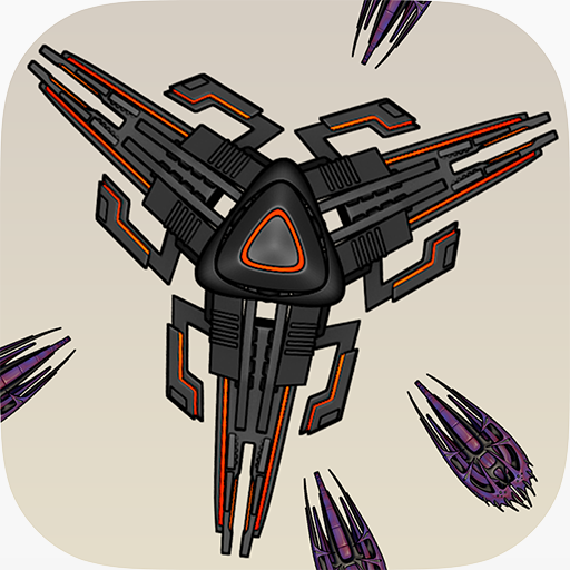
This icon was our first design, using a slightly lavender background and featuring the nexus in the center. The aliens coming from the sides was supposed to show viewers what the game was about. However, after using it for a while in development, we began to dislike its design. The nexus was not exactly centered, and there were too many aliens coming from the side; it convoluted the icon. Also, it looks better up when scaled, but on an iPad or iPhone device the icon is really small and it’s hard to see much anyway.
Icon #2

This was our second design. We chose a slick, black background to give it a sense of space or evil, along with a single alien in the center. The addition of the white N was to symbolize the name of the game, Nexus Defense. However, although this icon has its own advantages, we decided that it didn’t really fit with the whole “game theme” and that we should go back to the drawing board to fix it.
Icon #3
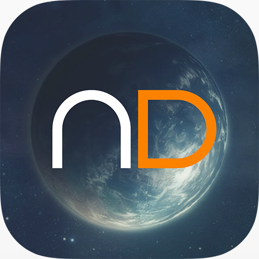
This was our third and final icon design, combining the space aspect, as well as a simple ND in the center. This time, the proportions are correct, the image and the text are properly centered, and we get our message across. Also, we used a blue, white, orange color scheme, which can be seen in some of our promotional images as well. This icon received all positive reviews from our beta-testers, a whopping increase from the previous icon. This icon is here to stay! 😀
-DBP
